Mr. Beau Type and the art of noticing
What began as a personal archive has become one of Montreal’s most quietly compelling design diaries.

By the time Steve St. Pierre noticed the sticker, he was already halfway across the Van Horne overpass. Tunnel vision, no sleep, heading back to Ottawa to say goodbye to his father. His partner pointed it out, letters on a railing: “Alain.” His dad’s name. It was a musician’s promo sticker, nothing more.
But to Steve, “it was this synchronistic moment.” He took a photo.

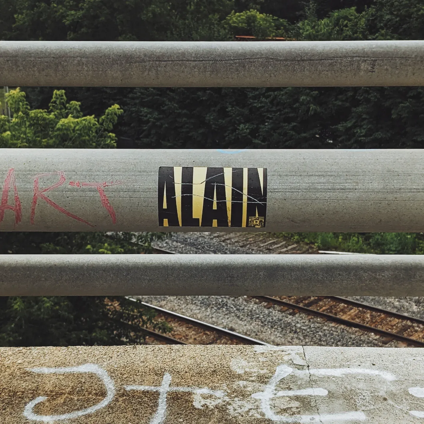
That weekend, he had come home to Montreal for a break after months of caregiving. His father had been diagnosed with cancer, and Steve had been by his side through the final stretch, from diagnosis to death.
“I was his primary caregiver throughout the entire thing,” he says. That morning, as he walked to the train station to head back, everything blurred—until that small sticker snapped him out of it. “Now every time I walk past it, I touch it,” he says.
That’s how this whole thing works. A sign, a sticker, a window decal—most of us walk past it. Steve doesn’t.

His project, Mr. Beau Type, is an ongoing visual archive of vernacular typography around Montreal, posted (quietly, methodically) to Instagram. There’s no grand thesis to it, but there is a raw energy to a grid of beer store signs in tape, pizza joints with 1970s flair, enamel address plaques, and café branding both accidental and intentional.
“I didn’t start this with any purpose,” he says. “I was in a pretty massive depression… I wasn’t leaving my house. Scrolling through my phone, I saw that I had always documented type. It started as a means of getting out.”


The first real fixation
Steve is a brand identity designer by trade, with nearly two decades of experience working across agencies, startups, and cultural organizations. He’s designed beer labels for friends-turned-brewers in Prince Edward County. He’s worked with progressive orgs like Action Canada for Sexual Health and Human Rights. He once thought he’d be a copywriter, but design took over.
“I thought copywriters were the ones that got to come up with all the ideas,” he jokes. “But design has always been something that I wanted to pursue.”
His influences are a who’s-who of timeless design: Paul Rand, Saul Bass, Paula Scher. “They were the pioneers,” he says. “They led the way in a really good way.” More recently, he’s drawn inspiration from Aaron Draplin, with whom he’s been email pen pals for years.

“I aped his work for a really long time as I tried to find my own voice.” And if there’s a Canadian name to mention, it’s Burton Kramer—the mind behind the CBC’s classic exploding pizza logo.
“I’ve loved that logo since I was a kid,” he adds. “And discovering Kramer’s other work just deepened that appreciation.”


But it was after moving to Montreal from Ottawa in 2022, when he was untethered in a new city, that he found himself walking. A lot. The project began there—on foot, with his phone, in neighbourhoods he didn’t yet know. The first real fixation? Those blue enamel house number plaques.
“I love the type on them. I wanted to turn the numbers into a font,” he says. “I’m not a type designer, but it gave me something to fill my brain with.”

The art of noticing
As he documented more, the idea of a name came up. Mr. Beau Type. A branding pun, sure—“I love naming things, that’s the branding background, I guess,” he says—but also a self-effacing joke.
“To refer to myself as a nice guy… I can be a little bit prickly at times,” he laughs. “I love the duality of it.”
That tension—between the polished and the rough, the visible and the invisible—runs through the whole project. A brand identity designer obsessed with signs that were never meant to be part of a brand.


“There was a dep past Leonard Cohen’s old house,” he recalls. “They obviously sell beer, and someone had taken masking tape and spelled out ‘bière’ in the window in this really janky type… It stopped me in my tracks.”
He calls it ‘the art of noticing,’ and it’s as much about intent as aesthetics.
“It’s about people taking it into their own hands… I love well-designed stuff too, but those hyperspecific, created-just-for-this-purpose signs—that’s what gets me out and interested.”

Bookmarks of grieving, records of joy
The city, through Steve’s lens, is a series of design dialects. “Each neighbourhood truly has its own unique feel,” he says. “Plaza St-Hubert has all the textile shops—very bold, in-your-face. Little Italy has its own look. Laurier feels more high-end, especially near places like Bar Henrietta or Taverne Pelicano. Then you go up Park and it’s different again.”
He’s noticed what he calls “one-upmanship”—one good sign inspiring another. Sometimes it’s a ripple effect of gentrification, other times it’s survival tactics.


And survival is a quiet subtext of Mr. Beau Type. The photos are aesthetic exercises, and they’re emotional timestamps. “I remember geographically where I took them,” Steve says. “But also mentally. There’s an odd emotional connection to each one in its own unique way.”
Some are bookmarks for grief. Others are records of little joys. There’s no need for elaborate captions or essays. The images speak for themselves.

“Sign designers are unsung heroes”
He’s resisted turning the project into something it isn’t. “As someone that used to be a little bit more of a try-hard… I didn’t want to do that with this. I kind of in a way wanted to be invisible. Just document this for myself.”
When asked if it’s a brand or an archive, he doesn’t hesitate: “Archive just feeds into that selfish ideal… I know where I was when I took each photo, what was going on. It’s been a bookmark.”
Still, there’s something communal about it. A way of helping others notice what they’ve stopped seeing.


“Sign designers are unsung heroes,” he says. “And vernacular type is often a reflection of a lack of resources. It’s of a time and place. It serves a purpose.”
He’s not trying to elevate the work to museum status—if anything, the impermanence is part of the point. A zine makes more sense than a glossy retrospective. “Zines are ephemeral, accessible. Just like the signs. Some last 30 years. Some are gone in six months.”
As for this zine, it’s not full of design theory or long-form essays.
“I don’t want this to be more than it has to be,” he says. “Just to present the signs as I’ve captured them.”


And maybe that’s the point—the signs don’t need an audience to matter. Neither does he. “I kind of in a way wanted to be invisible,” he says. “To document this for myself.”
But invisibility, it turns out, can be its own kind of presence. That may be the clearest design statement of all: to document without embellishment, to preserve without claiming ownership, and to quietly show that everything speaks, if you’re willing to listen by looking.

This story originally appears in a limited edition book collaboration between Mr. Beau Type and The Main. Pick up a copy today before they're gone to support the work of local creatives and media.